Whenever the Olympic Games are held, it’s a fairly safe bet that at some point, someone will look at the medal table and qualify it based on the size and wealth of the countries doing well. And with the Winter Olympics, it obviously helps to have natural snow and ice. But how much do each of these things matter? And what else is a good predictor of success?
I took a look at the all-time winter medal table, with a bit of data cleaning. To conserve as much data as possible I combined the historical medal counts for East and West Germany with the united Germany, and also treated the Soviet Union as Russia’s predecessor (and included the so-called Olympic Athletes from Russia). Unfortunately there was no straightforward way to include Czechoslovakia or Yugoslavia, so only their successor states are included.
For that and other reasons, some countries have entered far more Winter Olympics than others, so the measure here is the average number of medals won per Olympics entered.
Such a large and varied set of countries creates a challenge, because to analyse their medal performances, you need comparable data for all of them. Some such data includes economic and demographic data from the CIA World Factbook, climate data from the World Bank, Prosperity Indices from the Legatum Institute and elevation data from a variety of sources, compiled by the Wikipedians.
First let’s look at them individually. (For the mathematically minded, we’re dealing with a lot of nonlinearity, so most of the following are estimated in log space):
| Correlations with average medals per Olympics entered* | |
| Population size* | 0.3515 |
| GDP* | 0.4933 |
| GDP per capita* | 0.3109 |
| Winter temperatures | -0.3778 |
| Elevation* | 0.3642 |
| Education1 | 0.4089 |
| Health1 | 0.1637 |
*As natural log
1Data unavailable for North Korea, Uzbekistan and Lichtenstein
The most obvious feature of the table above is that none of the variables do a particularly good job of explaining Winter Olympic success, though some are better than others. Population size has a 0.35 (i.e. 35 per cent) correlation with average medals won, and economic output per head 31 per cent (if you combine the two as total GDP, it still amounts to just 49 per cent). Annual temperature lows, though problematic because climates can vary a lot within countries, score -0.38 (i.e. a 38 per cent correlation with how cold it gets). The elevation measure simply takes the highest point in each country, but still has a 36 per cent correlation with medals per Olympics.
Education (as measured by that component of the Legatum Prosperity Index) is an interesting variable, because at 41 per cent it has one of the higher correlations. It’s also slightly misleading, because many of the countries with the highest educational standards also happen to have cold climates (in Northern and Alpine Europe).
But the health of the wider population (Legatum measure) doesn’t explain much of the performance of elite athletes, with a correlation of 16 per cent. That’s not necessarily to say that a healthy population doesn’t aid sporting success, nor that national Olympic success doesn’t inspire healthier lifestyles. However it isn’t possible to discern either such effect from this data.
If we combine these variables into a “prediction” index, using population size, GDP per capita, temperature and altitude (education is strongly correlated with GDP per capita, so isn’t included in the model), the index has a 71 per cent correlation with each country’s average medals won.

For those you that read Number Cruncher Politics, this chart will look a bit noisy – the data points don’t hug the trend line that closely. That means quite a lot of countries doing better or worse at the Winter Olympics than their fundamentals suggest they should, which is what you’d expect. That’s partly because the model isn’t perfect, but more importantly because countries (and athletes) that put in the extra effort, tend to be rewarded for it.
This kind of model lets us split out the different components – the ingredients for success, so to speak. Have you ever noticed how dividing medals won by population usually makes small countries look good and large countries look bad? There’s a reason for that – you get diminishing returns on population size. The next chart shows (using the same model) how many medals a country with an average economy, climate and highest point should normally win depending on its population:

Having more citizens to select athletes from is definitely an advantage. But that advantage gets smaller the bigger a country gets. If country A has twice the population of country B, it has 100 per cent more people, but (other things being equal) this only increases its medal prospects by 26 per cent.
That’s not true for GDP per capita. The richer a country is per person, the better it does, and that’s just as much the case for Norway as it is for North Korea.

All of that points strongly in the direction of funding. The actual sports budgets are difficult to get hold of on a comparable basis for each country, but Great Britain provides an interesting case study. With a relatively mild climate for a Winter Olympic medal winning nation, and no big mountains, Britain should win 1.7 medals per games and has actually averaged 1.3. But at the last two Winter Olympics, Team GB averaged 4.5 medals, after more than 20 years of lottery funding – something that doesn’t seem like a coincidence.
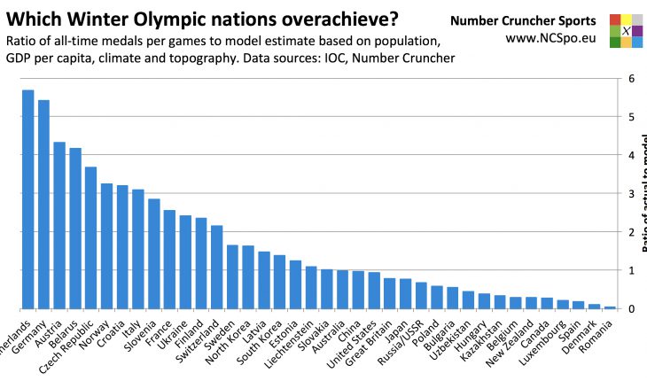
So if we rank each country in terms of how of how it performs relative to how a country of its population size, income per head, climate and topography theoretically should, how would the all-time medal table look? Here it is:
| Rank | Country | Medals per games | Theoretical medals per games | Ratio |
| 1 | Netherlands | 6.2 | 1.1 | 5.68 |
| 2 | Germany | 19.3 | 3.6 | 5.42 |
| 3 | Austria | 10.1 | 2.3 | 4.33 |
| 4 | Belarus | 2.6 | 0.6 | 4.17 |
| 5 | Czech Republic | 4.4 | 1.2 | 3.68 |
| 6 | Norway | 16.0 | 4.9 | 3.24 |
| 7 | Croatia | 1.4 | 0.4 | 3.20 |
| 8 | Italy | 5.4 | 1.7 | 3.09 |
| 9 | Slovenia | 2.1 | 0.7 | 2.84 |
| 10 | France | 5.4 | 2.1 | 2.55 |
| 11 | Ukraine | 1.1 | 0.5 | 2.41 |
| 12 | Finland | 7.3 | 3.1 | 2.35 |
| 13 | Switzerland | 6.7 | 3.1 | 2.15 |
| 14 | Sweden | 6.9 | 4.2 | 1.63 |
| 15 | North Korea | 0.2 | 0.1 | 1.63 |
| 16 | Latvia | 0.7 | 0.5 | 1.48 |
| 17 | South Korea | 3.9 | 2.8 | 1.38 |
| 18 | Estonia | 0.7 | 0.6 | 1.24 |
| 19 | Liechtenstein | 0.5 | 0.5 | 1.09 |
| 20 | Slovakia | 1.1 | 1.1 | 1.00 |
| 21 | Australia | 0.8 | 0.8 | 0.98 |
| 22 | China | 5.6 | 5.9 | 0.96 |
| 23 | United States | 13.2 | 14.1 | 0.94 |
| 24 | Great Britain | 1.3 | 1.7 | 0.78 |
| 25 | Japan | 2.8 | 3.6 | 0.76 |
| 26 | Russia/USSR | 20.8 | 30.9 | 0.67 |
| 27 | Poland | 1.0 | 1.6 | 0.58 |
| 28 | Bulgaria | 0.3 | 0.5 | 0.55 |
| 29 | Uzbekistan | 0.1 | 0.3 | 0.44 |
| 30 | Hungary | 0.3 | 0.8 | 0.38 |
| 31 | Kazakhstan | 1.1 | 3.5 | 0.33 |
| 32 | Belgium | 0.3 | 1.0 | 0.29 |
| 33 | New Zealand | 0.2 | 0.7 | 0.28 |
| 34 | Canada | 8.7 | 31.1 | 0.28 |
| 35 | Luxembourg | 0.2 | 1.0 | 0.21 |
| 36 | Spain | 0.2 | 1.2 | 0.17 |
| 37 | Denmark | 0.1 | 0.8 | 0.10 |
| 38 | Romania | 0.0 | 1.0 | 0.05 |
On this measure, the Netherlands comes top with 5.68 times its theoretical medal total (an average of 6.2 medals per Winter Olympics), ahead of Germany and Austria. Large countries tend to be close to par (China 0.96 times, United States 0.94 times), which I’ll come back to in a moment. The countries that underperform their fundamentals the most are Romania (0.05 times), Denmark (0.1 times) and Spain (0.17 times). Interestingly, and despite performing well in absolute terms, Canada’s average of 8.7 medals is only 0.28 times the 31.1 medals that it theoretically “should” have averaged.

Is there any common theme here? Well, there are some geographic nuances, like Spain having some high mountains but little snow and Austria being more mountainous than other countries with similar highest summits.
But there may be sporting reasons too. The Dutch dominate long track speed skating and speed skating dominates the Dutch medal count – including short track medals, speed skating accounts for 97 per cent of all Winter Olympic medals won by the Netherlands. There are multiple distances and multiple skaters per country in each. By contrast, Canada dominates the team sports of ice hockey and curling, but until 1998, these sports offered just one medal (the mens ice hockey) between them. Canada also has 25 medals (13 per cent of its total haul) from Freestyle skiing, which didn’t even feature at the Olympics until 1994.
This “specialism” effect might explain why the USA and China have won almost exactly as many medals as their fundamentals imply – larger countries don’t (need to) specialise as much, and spread their efforts across many sports.
So the recipe seems to be as follows: Be big, be rich, be cold, be mountainous, and be good at the sports with lots of medals…